Astor Place (digital)
© Brian Rose
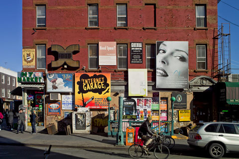
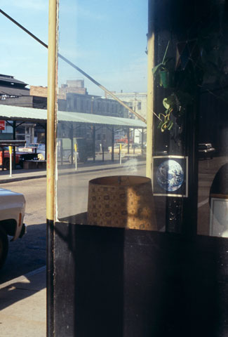
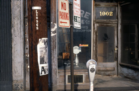
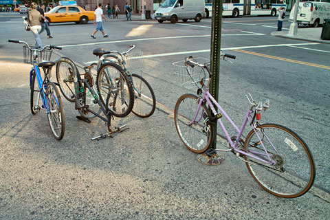
The photograph above shows how bikes tend to be parked in New York. Usually, the only option is a signpost or light pole. Every now and then, one finds the repeating U shape rack as seen to the left. Not always with three bikes, one of them upside down.
Having lived in Amsterdam for 12 years–while traveling back and forth to New York–and married to a Dutch urban planner, I feel I can comment with some level of authority on the issue of bike racks. The Netherlands, as is well known, is among the most bicycle-oriented places in the world, but even there, they continue to struggle with the problem of parking and storing thousands and thousands of bikes on the city streets.
The Dutch attach their bikes to anything sturdy including light poles, signposts, bridge railings, fences, you name it. Bike racks, too. A quick image search on bike racks in Amsterdam produces dozens of different designs, mostly incredibly complicated and impractical. Despite the apparent riot of different designs, the official bike rack for central Amsterdam is a simple bent piece of metal shaped like a staple. There are no photographs of them on the Internet, presumably because they are so uninteresting. Unobtrusive is a virtue in my opinion.
Astor Place (digital)
© Brian Rose
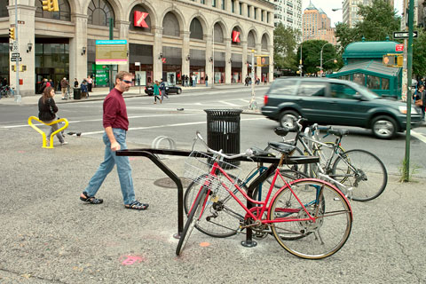
The Bloomberg administration has actively promoted bicycle use in New York City, creating bike lanes, and in some cases, segregated bike paths along major avenues. The city has just completed a design competition for what will become the standard bike rack used throughout the five boroughs. Prototypes of the 10 finalists were mounted on the traffic island in Astor Place–the one with Alamo, the famous black cube sculpture by Tony Rosenthal.
Astor Place (digital)
© Brian Rose
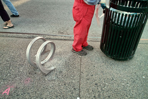
Good for sitting on.
Astor Place (digital)
© Brian Rose
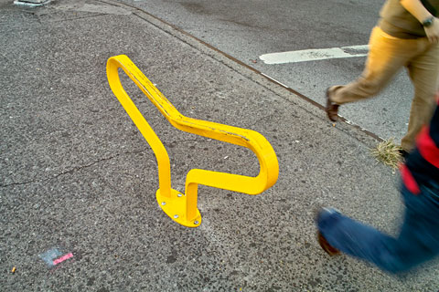
Good for tripping over.
Astor Place (digital)
© Brian Rose
Not bad.
Astor Place (digital)
© Brian Rose
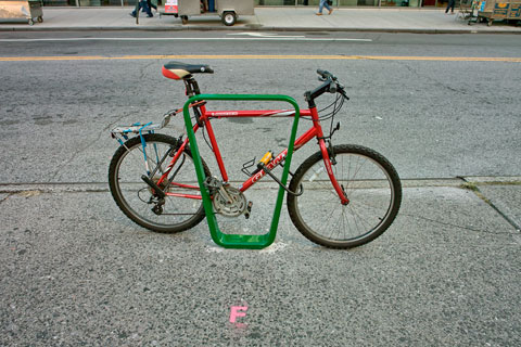
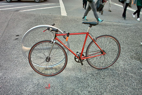
Looks good with this bike.

Astor Place (digital)
© Brian Rose
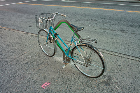
Almost.

Astor Place (digital)
© Brian Rose
Brendan, my son, leaning on the wittiest of the bunch, modeled after a steel cable bicycle lock.
Astor Place (digital)
© Brian Rose
The winning design, “Hoop,” by Ian Mahaffy and Maarten De Greeve, based in Copenhagen. It’s one of the simplest of the designs, can be used singly or in groups, parrallel to the curb when the sidewalk is narrow, and perpendicular when there is more space. Those commenting to the article on the New York Times website are all concerned about how it can be securely attached to the pavement. I think the round shape gives people the impression that it just grazes the surface of the sidewalk. But imagine a steel post beneath the wheel at the point where it touches the ground. It should be at least as sturdy as the traffic signposts already used by most cyclists.
It’s elegant, flexible, iconic. I like it.