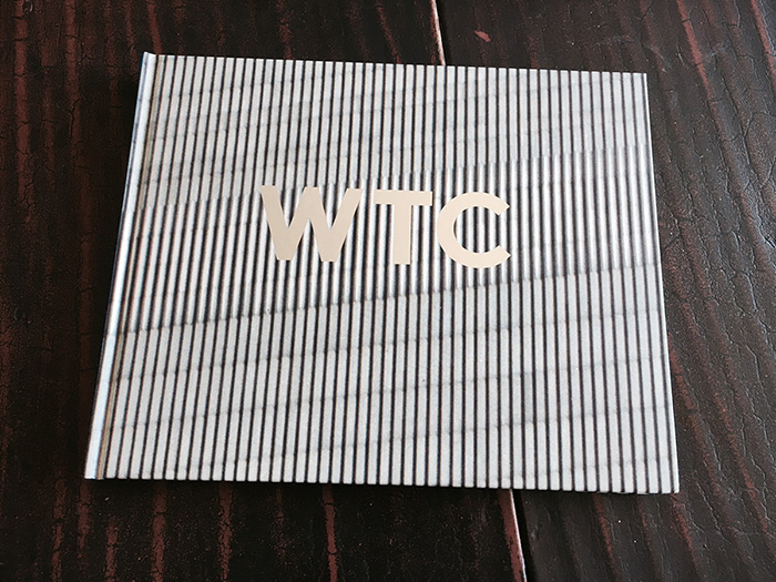
This is it folks. Advance copies of WTC have arrived from the printer, and — what can I say — the book is stunning. The original design for the cover had the letters WTC dissolving into a close-up of the skin of one of the Twin Towers, symbolic of their disappearance and ghostly presence. But we decided to go with silver reflective letters that almost float above the matte background. The effect is stronger, more iconic. It is simple, elegant, and I think, powerful.
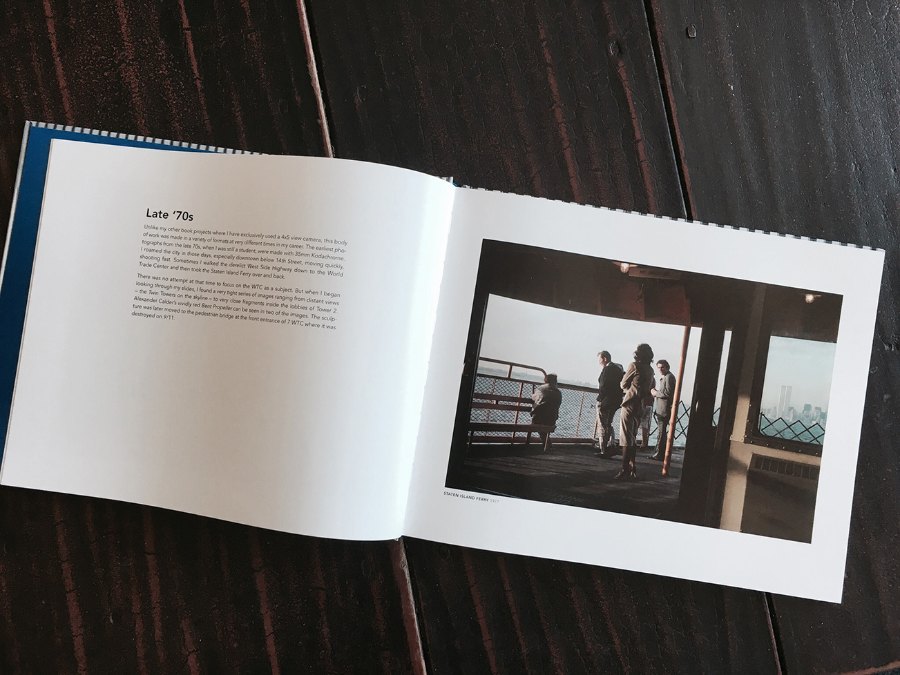
The spine and endpapers are a cool blue, taken from wedge of sky seen between the Twin Towers in one of the images. The photographs and text blocks are a consistent scale with white borders throughout except for the bleed images that break up the different sections. This is a book to be read — both the writing and the imagery.
I am very proud of WTC. It is the third in a trilogy of books about New York City. It is the culmination of a lifetime of observing the urban landscape and architecture, the center stage for human endeavor. It is a story both personal and shared — this great city and the tragedy that befell it 15 years ago. It is an attempt to honor and commemorate even in this moment of public vulgarity and corrosive discourse.
The official release of WTC is September 8th. I will be providing more information about the launch later. In the meantime, the book can be pre-ordered on my website.