In 1975 when I first went to art school (MICA in Baltimore) I was shooting exclusively in black and white. It was understood implicitly that fine art photographs were monochromatic–color was National Geographic and cigarette ads.
I’d been interested in color for a couple of years going back to a single roll of slide film that I ran through my camera. I had glossy 8x10s made of two of those images. But the color photography class at MICA in those days was mostly a tedious print making exercise that I avoided. In 1976 I started shooting 35mm slide film (mostly Kodachrome), was hooked, and never went back. I left Baltimore for New York, and ended up at Cooper Union where I studied with Joel Meyerowitz. By the end of 1979 I had begun my first major project, (in color) photographing the Lower East Side.
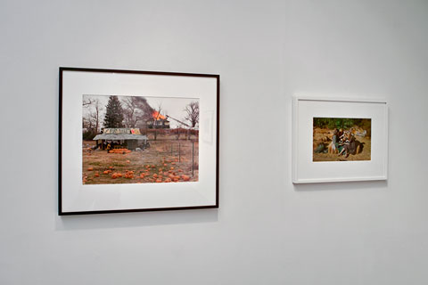
Joel Meyerowitz images from When Color was New (digital)
Julie Saul Gallery
Meyerowitz was one of 20 photographers in When Color was New, an exhibition that just came down at Julie Saul Gallery in Chelsea. The exhibit, although modest in scope, covered many of the key players in what was a fairly small circle of people exploring color as a serious photographic medium. Until that time, photography was mostly relegated to the “photo ghetto,” as we called it, galleries that generally showed smallish black and white prints, and tended to favor “concerned photography” or still lifes and landscapes rendered in luscious tonalities. Plenty of good stuff in there, don’t get me wrong, but none of it cutting edge in my estimation. Light Gallery, in New York, was a notable exception, showing the most innovative work of the 1970s including color when it emerged toward the end of the decade.
When Color was New covered the range of work done at the time including more conceptual work like John Pfahl’s as well as the multi-frame images of Jan Groover. Groover was a break out artist in the ’70s because her work was shown in a “real” gallery as opposed to a purely photographic house. What I like about these earlier constructed images by Pfahl and Groover is that you can see the artifice of the work unlike the many seamless Photoshop concoctions of the present.
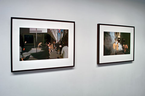
Joel Sternfeld and Mitch Epstein images (digital)
Julie Saul Gallery
The show included two Meyerowitz street photographs–pictures that I was familiar with in the late 70s–vividly preserved as dye transfer prints. Dye transfers were expensive to produce, but were inherently stable pigment based prints unlike C-prints. But C-prints were possible to do yourself–I printed at a rental lab–and much of the early color work was done that way. The vintage C-prints in the show were, generally, faded and yellowed, which I suppose is acceptable from a historical collecting point of view. But it is not the way to view these previously vibrant images. It is now possible to go back to the original negatives, scan them, and achieve results that make vintage C-prints look like ancient artifacts. Even familiar images like Joel Sternfeld’s picture of the Space Shuttle or Martin Parr’s hot dog eaters, were shown faded and color shifted. These are artists who are very much alive and kicking.
In no way to denigrate this enjoyable show, however, I think it’s time for a major survey exhibition on this important period of photography history. There are others, beyond the 20 photographers in the show who deserve inclusion–Len Jenshel and Jan Staller are two who come to mind–and I would hope my own work from that period might also find a spot.